Rebranding, Web Design & Development

IA Sprog

IA Sprog is the oldest and largest language school for foreigners in Denmark and has been leading their industry for over 40 years. With their new branding, website and social media strategy, they now have an identity that lives up to the quality of their courses.

About the project

IA Sprog needed an update to their visual appearance, as well as their website architecture. Their content had outgrown the design which resulted in a bloated website that was hard to navigate, and the aesthetics were starting to look fairly outdated. Initially, we were only tasked with a redesign of their website, but the scope of the project quickly grew to also include rebranding, photography, copywriting, print design and communication strategy. The goal was to get a cleaner and more professionally looking brand across all publications, and a website with a clearer structure over a fairly complex course-system.

My Role

I was assigned to do the rebranding, web design and development of the new site. In order to modernise their brand and make it more coherent across all of their touchpoints, I build an online style guide with a cleaned up logo, a new colour scheme, a typography guide, and a bunch of modules that can be used online as well as in print. I then designed multiple layouts with different approaches on how we could structure their courses. Once we landed on the final design, I developed the website and integrated it into WordPress.

Branding rewind

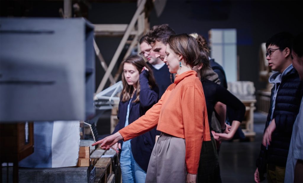
IA Sprog’s teachers are experts in Danish language education. If you are a student at IA Sprog, you can be certain that you are learning from one of the most experienced schools with Denmark’s best educators. We wanted their brand to clearly state this. This meant taking a good look at their current branding, and figure out how we could improve their style and make them look modern and professional. We considered completely changing their logo, but decided to clean up the existing logo instead. The logo has been in use since 2001, and changing it would not only be expensive as it would require changes to a lot of existing material, it could also hurt their recognisability. But we did consider it necessary to clean up the overall branding in terms of logo, colours, photo-material and typography.

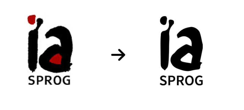
The logo was vectorised and simplified in order to make it less ‘grungy’ and more friendly and professional. We removed the primary colour from the logo as we found that to look a little too childish for the adult audience we’re targeting.

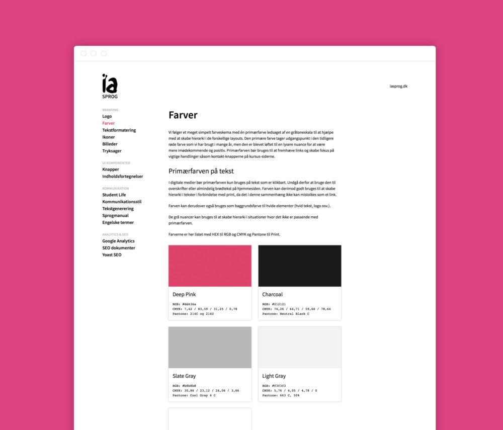
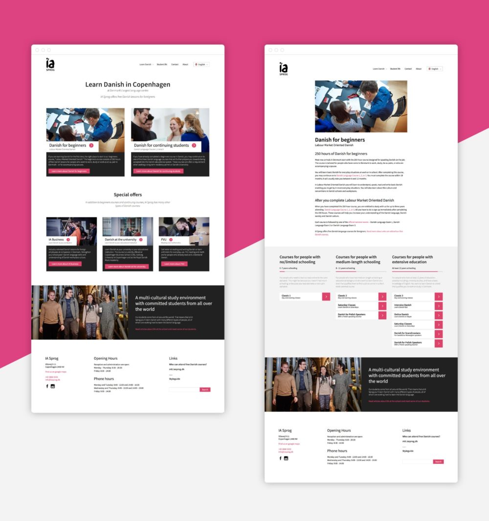
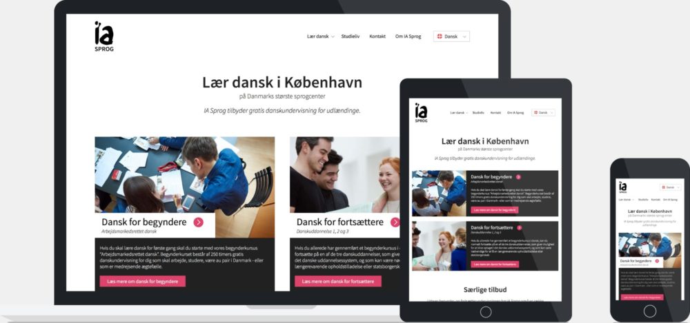
In cases where we are using colour, we decided to move away from the dark red that they had used previously, and instead move to a more friendly deep pink. The deep pink is also one of the few colours that don’t have conflicting associations across different cultures, which is important as their students come from all over the world.

We chose to use ‘Source Sans Pro’ for all their typography. It is a modern and flexible font that looks good at large sizes and is very easy to read at small sizes. It was also important to pick a font with support for many languages and character sets, as we have content in Danish, English, Polish, Russian and likely more in the future.

Typography

Source Sans Pro is a modern and flexible font with wide language support.

Color Palette

We moved away from the dark red color they had used previously to a more friendly deep pink, accompanied by light gray.

Photography

We worked with photographer Lui Baes on building a library of high quality photos of the students, teachers and various locations.

Style guide

With more than 100 employees, it was clear to us that we needed to develop an accessible style guide in order to ensure consistency across their internal teams. We build a living style guide as a WordPress ‘child theme’ to live alongside their main website. This means that all style changes we do to the style guide, will also affect the website and vice versa, and ensures that the two will always be aligned.

The style guide sums up all the decisions that have been made through working with IA Sprog. IA Sprog’s employees across all their divisions can download the logo, fonts and relevant photography. They can find useful information on anything from ‘tone of voice’ to SEO, and developers can find code examples on how to implement different modules on the website. Everyone who has been involved in the project contributed to the style guide, ensuring that it would be an all-around useful resource. And since the style guide is accessible via the CMS, it is easy to update as IA Sprog evolves over time.

Structure — getting organised

The Danish language education system for foreigners is extremely complex. The course structure is the result of several different governmental legislations and rules defining what courses are available to what students. Because the language education is free in Denmark (paid for by the Danish government), the language schools have to follow the structure set by the government and try to make it clear to the students what options they have when choosing a course. Adding to the fact that most students will be reading about this complex system in a secondary language, it becomes critical that the information hierarchy is as clear as possible. Getting this right was definitely the main focus of the design phase.

We went through several iterations before landing on the final design. We ended up categorising all the courses into two major groups based on whether or not the student had ever received Danish lessons before. We then organised the courses within these two groups based on the individual students schooling background. This way potential students can filter through two simple steps in order to get an overview of the options available to them.

Results and takeaways

Building large websites for businesses with many departments and lots of different products can prove challenging. It is incredibly important to be flexible and prepared to iterate through different solutions in order to come up with the most effective end result. We went through 4 different structures for the page hierarchy before landing on a design that we were all happy with that respected overall usability as well as department-specific needs. After launch, the bounce-rate immediately dropped by 10-20% and the school’s secretary staff experienced a notable increase in leads from the contact page.