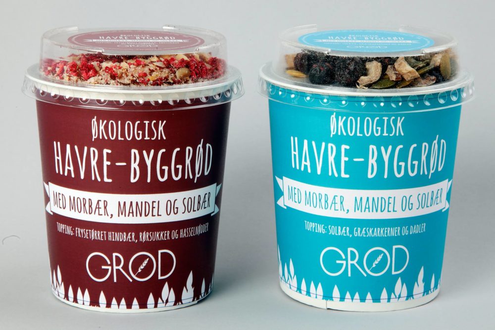
Having worked with GRØD before, I was aware of the unique brand that GRØD has been building since it first opened in 2011. This product was the first product to be sold outside of GRØD’s own stores, and it was important to maintain the brand and it’s values while standing out, yet fitting in on the shelves at 7eleven.
We moved away from the typical photograph-based instant porridge that has been seen before and landed on a simpler 4-color print that clearly communicates the different variants by contrasting background colours. The cups are now more often referred to by their colour than what’s in them.

