srcset and sizes
The responsive image spec boil down to two tags and two attributes. The first tag we’re going to look at is our good old <img> tag. The <img> tag has been upgraded with two new attributes: srcset and sizes. These two attributes tell the browser what resolutions are available for a given image, and what size the image is supposed to be displayed at, at any given breakpoint. Based on this information, the browser is able to choose and download the most optimal image file for any given device.
<img src="http://www.yoursite.com/images/danceface-medium.jpeg"
	srcset="http://www.yoursite.com/images/danceface-tiny.jpeg 150w,
			http://www.yoursite.com/images/danceface-small.jpeg 300w,
			http://www.yoursite.com/images/danceface-medium.jpeg 600w,
			http://www.yoursite.com/images/danceface-large.jpeg 1000w,
			http://www.yoursite.com/images/danceface-extra-large.jpeg 1200w,
			http://www.yoursite.com/images/danceface-extra-extra-large.jpeg 1500w,
			http://www.yoursite.com/images/danceface-super-large.jpeg 2000w"
	sizes="(min-width: 80rem) 50rem,
		   (min-width: 50rem) 38rem,
		   (min-width: 45rem) calc(100vw - 10rem),
		   100vw"
	alt="A photo of dancing face">
In this example, I’ve included seven different resolutions and four different media queries. At first glance, this might seem a bit excessive, and you are likely to find examples that only include three images for the sake of brevity. But I think it’s important to point out that in most cases you’ll want more than three resolutions. It obviously depends on the layout, but keep in mind that you typically want to cover at least 3 breakpoints for both standard and retina displays. And if you also want crisp images on 4k and 5k displays, you’ll need to include fairly large resolutions as well.
The srcset attribute contains a comma-separated list of URLs with a w-descriptor, informing the browser how wide each source file is. One awesome thing about this syntax is that we don’t need to tell the browser what images to use for high pixel density displays, and what images to use for standard displays. If we give the browser enough resolutions to choose from, it will be able to pick the best size for the situation.
Note: You might come across the legacy x-descriptor introduced by apple a while ago to specify the retina resolution of an image. It is now best to avoid the x-descriptor, as the w-descriptor replaces it completely and is much smarter.
While the srcset attribute describes the actual width of the source files, the sizes attribute tells the browser how wide the image is supposed to be displayed on the screen. This is done with the use of inline media queries. They work exactly the same as in CSS, except you only use it to describe the displayed width of the image.
Does order matter?
This was one of the first gotchas for me when I started using srcset and sizes. The order of the image-URLs in the srcset attribute doesn’t matter. But to keep the code readable I tend to start with the smallest resolution and scale up. The order in the sizes attribute, however, matters a lot! The browser will use the first media query that matches the current state of the browser. This is why the order in my sizes attribute is in reverse of the srcset attribute, starting with the largest display first working my way down to mobile. I could get around the reversed order by simply using max-width instead of min-width in the media queries, but my CSS usually take a mobile-first approach, and I prefer to keep the media query conditions the same in both places. It makes it easier to read, and it allows me to copy-paste between the files more easily. No matter how you prefer to write the media queries in the sizes attribute, the important thing to remember is that the browser will read the rules from the top down and pick the first match it finds.
What about the new picture element?
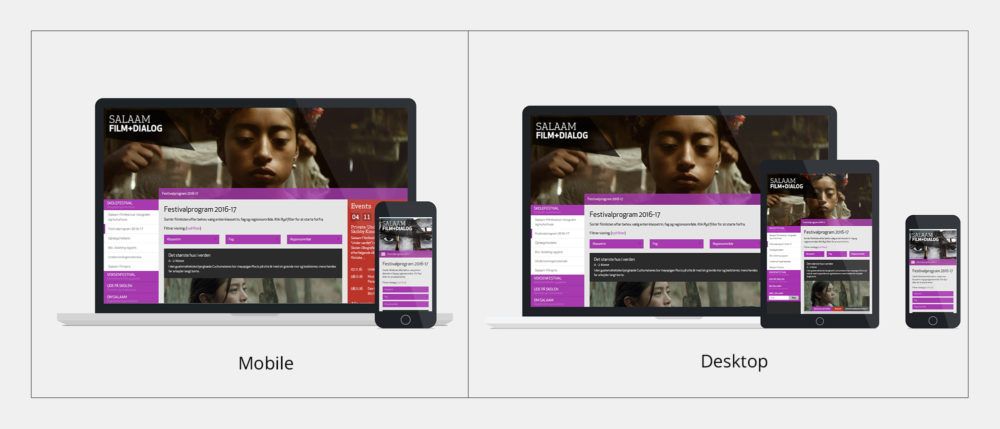
The <picture> element provides even more control over how we want our images to be displayed across devices. This additional layer of control is necessary in cases where we need to art direct the image differently for different screen sizes. One good use case that I found for this, was when I needed to display two different versions of a device mockup in my portfolio. I wanted to showcase the responsive layout of a website by lining up screenshots on the three most popular types of devices. But when I displayed all three devices next to each on small screens, the image appeared too small. So I decided to make a different version with only two devices for users on small screens, while showing the full version with all three devices on large screens. The message of the image is the same, but the picture element allowed me to art direct the image while still getting all the benefits of srcset and sizes.
We can’t do this with the <img> tag, because we’re not able to control what image version the browser picks at different screen sizes. With the <img> tag we let the browser decide from a list of resolutions. With the <picture> tag and its accompanying <source> child tag, we specify multiple lists of resolutions and explicitly tell the browser what list to choose from depending on the screen size. Let’s see what the picture element looks like.
<picture class="content-block-two-columns-image-picture">
	<!-- Large art direction -->
	<source media="(min-width: 800px)"
		srcset="http://www.yoursite.com/images/myface-landscape-medium.jpeg 600w,
				http://www.yoursite.com/images/myface-landscape-large.jpeg 1000w,
				http://www.yoursite.com/images/myface-landscape-extra-large.jpeg 1200w,
				http://www.yoursite.com/images/myface-landscape-extra-extra-large.jpeg 1500w,
				http://www.yoursite.com/images/myface-landscape-super-large.jpeg 2000w"
		sizes="(min-width: 60rem) 60rem, 100vw">
	<!-- Small art direction -->
	<source
		srcset="http://www.yoursite.com/images/myface-landscape-tiny.jpeg 150w,
				http://www.yoursite.com/images/myface-landscape-small.jpeg 300w,
				http://www.yoursite.com/images/myface-landscape-medium.jpeg 600w,
				http://www.yoursite.com/images/myface-landscape-large.jpeg 1000w"
		sizes="100vw">
	<!-- Fallback image for browsers that don't support the picture element -->
	<img src="http://www.yoursite.com/images/myface-landscape-medium.jpeg 600w"
		srcset="http://www.yoursite.com/images/myface-landscape-tiny.jpeg 150w,
				http://www.yoursite.com/images/myface-landscape-small.jpeg 300w,
				http://www.yoursite.com/images/myface-landscape-medium.jpeg 600w,
				http://www.yoursite.com/images/myface-landscape-large.jpeg 1000w,
				http://www.yoursite.com/images/myface-landscape-extra-large.jpeg 1200w,
				http://www.yoursite.com/images/myface-landscape-extra-extra-large.jpeg 1500w,
				http://www.yoursite.com/images/myface-landscape-super-large.jpeg 2000w"
		sizes="(min-width: 60rem) 60rem, 100vw">
</picture>
You can think of the <picture> element as a group of image source lists. Each individual <source> work much like a single <img> tag, but with an added media attribute. This allows us to specify different groups of sources for different breakpoints, while still benefitting from the browsers ability to choose the most optimal resolution of a given image. This is pretty powerful, but in 9/10 cases unnecessary. You should mostly lean towards using the <img> tag if you can, as the picture element requires content creators to art direct, which can bring unnecessary overhead. And if the site is using a CMS, this can be further cumbersome to set up and maintain. But in the cases where you need that extra bit of control, the <picture> element can be extremely useful.
Responsive images in WordPress
Now that we know what responsive images look like in code, let’s take a look at how we can implement them into WordPress. Native support for responsive images came to WordPress in version 4.4. Let’s take a quick look at the release notes:
“WordPress now takes a smarter approach to displaying appropriate image sizes on any device, ensuring a perfect fit every time. You don’t need to do anything to your theme, it just works.”
When you upload an image to the WordPress media library, it automatically resizes the image into multiple resolutions based on the specified media settings. This is something WordPress has done for a long time, and because of this, WordPress core can add the srcset attribute to all WordPress generated <img> tags automatically. However, WordPress can’t possibly know what size your theme is displaying the image at. So the best it can do is to assume a 100% viewport width up until the maximum width of the uploaded image. Because of this, the WordPress generated code ends up with just two rules in the sizes attribute, resulting in something like this:
<img src="http://www.yoursite.com/images/danceface-medium.jpeg"
	srcset="http://www.yoursite.com/images/danceface-medium.jpeg 300w,
			http://www.yoursite.com/images/danceface-large.jpeg 1024w"
	sizes="(max-width: 1024px) 100vw, 1024px"
	alt="A photo of a dancing face">
This is a very safe way of doing it, though definitely not the most optimal, and I would have to disagree with the statement that it’s “ensuring a perfect fit every time”. WordPress basically assumes that your image is being displayed at full browser width. So in web layouts where that isn’t the case, the browser is likely to download a larger version than what is necessary, unless we specifically customise the behaviour in our theme. Luckily, WordPress also added a few hooks to help us with that.
The first thing we need to do is change WordPress’s default behaviour for images added via the content editor and other native WordPress functions such as the_post_thumbnail(). To do that we have a filter called wp_calculate_image_sizes. This filter allows us to override how the sizes attribute is written for images, based on different conditions.
Let’s say that our content images are being displayed at 100% width on mobile, but on tablets we have a 200px fixed-width sidebar, making the content images 100% – 200px wide. We also have a maximum content width of 640px, which stops the image from ever growing beyond that no matter how large the screen is. We can set that up like this:
<?php
	/**
	 * Configure the "sizes" attribute of images.
	 */
	function THEMENAME_content_image_sizes_attr($sizes, $size) {
	    $width = $size[0];
	    if ($width > 640) {
	        return '(min-width: 840px) 640px, (min-width: 720px) calc(100vw - 200px), 100vw';
	    } else {
	    	return $sizes;
	    }
	}
	add_filter('wp_calculate_image_sizes', 'THEMENAME_content_image_sizes_attr', 10 , 2);
?>
We use the $width variable to ensure that the displayed image is big enough to utilise these breakpoints. If it isn’t big enough, we simply fall back to the regular WordPress behaviour described above, which should work fine for smaller images anyway. We then set a custom ruleset based on our design. In this case we set up three media queries to cover the scenario described above.
For some themes this might be all you need to do. Figure out what size the images are being displayed at in your theme, and filter the sizes attribute accordingly. You can even set up conditional statements to change the behaviour according to what template is being used. But there may also be situations where it is better to add the <img> tag directly into your templates. And WordPress 4.4 came with a few useful functions to help us with that too. The wp_get_attachment_image_srcset($attatchment_id, $size) function saves us from having to hand-code the srcset attribute, so that we only have to worry about the sizes attribute. This function only pulls resolutions of a given image that matches the aspect ratio of the size you define in the second parameter. So we don’t need to worry about it pulling weirdly cropped versions of our image. It is also worth noting that it will only add resolutions that are smaller than, or equal to, the size that you define.
So to code up a responsive <img> tag in WordPress you can do something like this:
<?php
	// Get this attachment ID
	$attachment_id = get_post_thumbnail_id( $post_id );
	$image_large_src = wp_get_attachment_image_src( $attachment_id, 'large' );
?>
<img src="<?php echo $image_large_src[0]; ?>"
  srcset="<?php echo wp_get_attachment_image_srcset( $attachment_id, 'non-cropped-extra-large' ); ?>"
  sizes="(min-width: 840px) 640px, (min-width: 720px) calc(100vw - 200px), 100vw"
  alt="<?php get_post_meta( $attachment_id, '_wp_attachment_image_alt', true) ?>">
This allows us to write our own sizes attribute for a specific spot in the design. And you can obviously do the exact same thing with the <picture> element:
<?php
	// Get this attachment ID
	$attachment_id = get_post_thumbnail_id( $post_id );
	$image_large_src = wp_get_attachment_image_src( $attachment_id, 'large' );
?>

<picture>
	<!-- Large art direction resolutions -->
	<source media="(min-width: 50rem)"
		srcset="<?php echo wp_get_attachment_image_srcset( $attachment_id, 'large' ); ?>"
		sizes="(min-width: 60rem) 60rem, 100vw">

	<!-- Small art direction resolutions -->
	<source
		srcset="<?php echo wp_get_attachment_image_srcset( $attachment_id, 'large-cropped' ); ?>"
		sizes="100vw">

	<!-- fallback -->
	<img src="<?php echo $image_large_src[0]; ?>"
		srcset="<?php echo wp_get_attachment_image_srcset( $image_large_id, 'large' ); ?>"
		sizes="(min-width: 60rem) 60rem, 100vw"
        alt="<?php get_post_meta( $attachment_id, '_wp_attachment_image_alt', true) ?>"
	>
</picture>
Making Google PageSpeed happy
Images are one of the more common causes for score penalties when testing websites with Google PageSpeed. It is still not uncommon for websites to use the same image resolution across all devices, resulting in unnecessarily large file sizes being loaded on small devices. I don’t always think Google PageSpeed scores should be considered the end all be all, but it definitely helps pointing out areas that can be improved upon for performance gains. It is also a tool that clients might use to test the quality of their own site. Because of this, we as developers have to do our best at making PageSpeed “happy”. It can be pretty tough to understand exactly how PageSpeed interprets your responsive images though. It isn’t immediately clear what size or screen resolution it uses to test your website, and sometimes the suggestions won’t make a lot of sense. If it does flag images as something that can be improved upon, a good trick is to try and download the PageSpeed-optimised versions.
But don’t be surprised if their compression makes absolutely no sense. Often you’ll see that it suggest resizing the images way too small, or compress them to a level that is just not acceptable in terms of quality. This could happen for a bunch of reasons. One reason might be that their technology isn’t necessarily interpreting responsive images correctly yet. I have especially noticed odd behaviour around the <picture> element. But if you set it up correctly it is possible to make PageSpeed happy.
One very important thing to be aware of is that PageSpeed wants JPEG’s to have an 85% compression or lower. If you use images at a higher quality than that, they are likely to be flagged as unnecessary large in filesize. PageSpeed also checks the source resolution against the displayed size and recommends resizing if the difference is too large. Lastly, it seems that PageSpeed isn’t taking different pixel density displays into consideration. So if you code a srcset attribute with five different resolutions, only two of them is going to be tested by PageSpeed — one for mobile and one for desktop. So while it’s a good idea to test your site with PageSpeed, it should not be considered a complete test when it comes to responsive images. You have to do your own testing to be sure that you are serving optimal images across all devices.
Testing responsive images with Chrome dev-tools.
When testing responsive images, it’s no longer enough to simply look at the source code, as that won’t tell you which source is actually being loaded by the browser. There are a few ways to go about testing, but my preferred way is to use Chrome’s dev-tools with both a 1x display and a retina display. If you open dev-tools, go to the network tab and reload a web page, you’re able to see exactly which files are being downloaded by the browser. Make sure you tick the “disable cache” checkbox and filter by images.
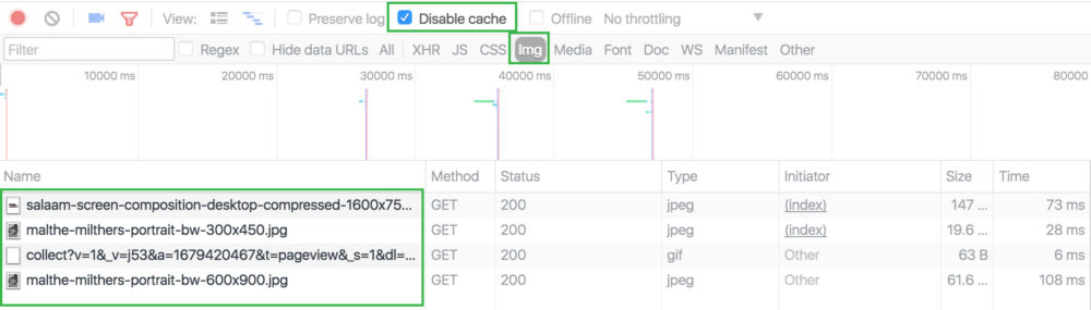
Now resize your browser to be narrow, similar to the size of a phone screen, and hit refresh. Dev-tools will now list the images that are being downloaded at that screen size. Keep in mind that your monitor’s pixel density matters, which is why it’s useful to test on a standard display as well as a retina display. If you then drag the browser window wider, you’ll notice the higher resolutions are being downloaded and added to the list when needed. Note that this doesn’t work the other way around, starting with a large browser and sizing down. This is because the large resolutions are going to work fine on the small screen, and fetching smaller resolutions is a waste of data. So you have to work from small to large when testing. Also important to note that not all browsers swap the resolutions on the fly. Safari (at the time of this writing) picks the resolution on load, and won’t swap on resize. So right now Chrome is better for testing.
Final thoughts
Once you feel comfortable with the responsive image spec, you’ll quickly realise how incredibly useful these new features are, and if you’re still not utilising them, you need to start now. There’s no excuse for forcing people to load unnecessarily large images to their phone over a 3g connection anymore. Depending on the level of browser support that you’re working with, you may still consider using a polyfill, but in most cases, these features can be used as a progressive enhancement as is.